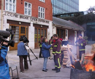
In a photograph in Friday’s evening paper, behind the firemen and the flames rising out of an old oil-drum, I recognised the relief lettering: L.C.C. FIRE BRIGADE STATION EVSTON 1902. I know the sign well. Above it is a little enamelled badge: that of the old London County Council. Their architect was W.E. Riley. The lettering is part of a very good piece of integrated Arts and Crafts design. In Riding House Street, north of Oxford Street, a building by H. Fuller Clark of 1908 announces in gold and green mosaic, over a couple of floors, that it was the premises of Boulting & Son, Sanitary and Hot Water Engineers. Another of Clark’s schemes, the ground floor of the Black Friar beside Blackfriars Bridge, sets out the name in the same green and gold.
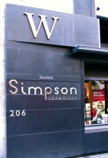
Such inscriptions, literally embedded in the façades, are among architecture’s most fragile elements. The fire station owes the preservation of its lettering to the vigilance of a printing historian, James Mosley, and an architectural historian, Andrew Saint; and to the fact that the building is still a fire station. When the clothing store Simpson of Piccadilly became a Waterstone’s bookshop a more painful battle of badges took place. Inside, mounted on an upstairs wall you can still find the old Simpson sign – a good piece of Art Deco lettering. It has been replaced on the front of the building with WATERSTONE’S in their undistinguished house style. On black stone, to either side of the façade at street level, ‘W, formerly’ has been added to the existing ‘Simpson Piccadilly’. It looks like the bodge it is. But you can’t expect a shop to wear a false livery – even English Heritage can only insist on the preservation of discarded pieces. The result is that a building of great style has lost an element which was to it what Lautrec’s monogram, say, is to his posters: a signature that is part of the work of art.
All this is symptomatic of a change in the way we get to know what a building is for. You used to know a church, theatre, school, almshouse or railway station when you saw one. A projecting sign differentiated one craft from another and, on grander buildings, a motto like the lettered band across Roger North’s gateway to the Middle Temple, was all the written direction you got – such inscriptions in any case celebrated what the building was rather than directed you to it. But over the years the identity of buildings with owners and functions has become weak. Words are now temporary, like notes stuck on a computer screen. Take the case of bank buildings. Many grand ones have become bars. The message the banking hall once gave (probity, substance) is now written into advertising copy and it turns out that banker’s pomp fits brewer’s cheer well enough. The architectural message of Victorian pubs was glitzier and on a smaller scale (less marble, more mahogany and cut glass), but at bottom both offered reassurance. For pubs, judging by the number of fake Victorian refurbishments around, the style still works. Banks, on the other hand, now need to say not just ‘this is the bank’ but ‘this is our bank,’ and to say it in odd places like shopping malls. So a corporate identitiy is applied to branches, cheque books, stationery: the lot.
When bank buildings are older than the latest affiliation, look for redundancies (on a grand Lutyens bank building in the City a discarded name – THE MIDLAND BANK – is still carved into the rusticated stonework by the entrance, while the red and white diapers of HSBC are hung out to catch the eye) and palimpsests (in Fleet Street you can still read ‘National Westminster’ on the granite, under the perkier ‘Natwest’). Badging is, of course, much cheaper and easier to apply than a deeper architectural identity. You can put a badge on any structure, and take it away painlessly, if expensively (the re-signing of a large corporation costs millions). But when a characteristic building becomes redundant – take the little Lutyens Midland Bank in the corner of the churchyard of St James’s Piccadilly – it is, like a dismissed servant who still wears your livery, a reminder of other, more solid days, even if pale patches where signs were are the only direct evidence of lost rank.
Because a corporate badge or logo has become the norm, the older signals – from the architecture itself or from integrated words – seem to need re-emphasis. So the new Somerset House logo, a little purple and white plaque, now hits you at eye-level as you turn in below Chambers’s entrance from the Strand. The finest and most assured entrance in London (although, I admit, one easy to miss) is thus given the equivalent of those designer labels which are placed on the outside of a piece of clothing.
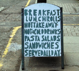
There are, though, still buildings which have no words on them at all. The clubhouses of Pall Mall and St James’s, for example, where the stranger invited to lunch at the Travellers must ask which it is, or remember that it is 106 Pall Mall and stands between the stucco one (the Athenaeum) and the bigger Florentine palazzo (the Reform). You can tell that the RAC, on the same street, is not a club for gentlemen because it has a whopping great flag outside. The next step up from this assumed domestic status is collegiate identity. Most of the staircase entrances of the Inns of Court have lists of names painted by a sign-writer – as do (or did) those of Oxbridge colleges. But now that typeset signs are so easily produced, handmade one-offness is becoming rare – the latest fashion in the Middle Temple seems to be to have the names printed on a sheet of milky-green glass. Sign-writing may in the end become an amateur craft, one which distinguishes the independent sandwich bar from Starbucks.
The ability to print type, photographs or drawings on plastic and stick the result over a whole building, a bus or a taxi has eroded the distinction between solid structures and scene-painting. The city has become a print-substrate, an almost anonymous structure which you read by way of notices, badges, signs, logos and banners. The battle between one message and another has escalated. There is a descending order of seriousness from the permanent to the ephemeral, and an order of conspicuousness running in the opposite direction. Cut in stone, your name will last. Serious donors to museums get that treatment: the British Museum has nothing on its front façade to say what it is, but the frieze of the east wing records the name of the man who gave the money to build it. Metal and terracotta also speak of permanence. But they are easy for the eye to slide over, to see as being of the building, not about it. Paint is brighter and easy to paint over. Plastic is cheap. Glass (painted on the reverse, perhaps gilded) is old-fashioned – pubs, old chemists’ shops – but elegant. Light – neon, backlit panels, digital displays – transforms dirty daytime streets into mesmerising funfairs at dusk.
Over the past couple of hundred years, the possibility of a single coherent reading of what you see as you stand in any one place has become more and more difficult. Each new message shouts as loud as it can, knowing that it has to compete. Consider what you must attend to as you walk down Piccadilly. Traffic-lights to stay alive. Shop signs which identify chains and products. Banners outside the Royal Academy in case you slip past without knowing what is on. On the corner of Arlington Street, waiting to cross over to the Ritz arcade, you can scan notices about parking, note the ‘no entry’ sign, and pick up the connotations of ‘The Ritz’ in lights: the bulbs set in a channel speak of 19th-century Paris and popular amusements as clearly as the Beaux Arts architecture of the Mewès and Davis building speaks of aristocratic ones. Waiting to cross the Strand to the Middle Temple you note not only the discreet City Heritage Award plaque but the larger and bolder red and white ‘CCTV cameras in operation’. Although these are things which, like other people’s conversations, we are good at not attending to when they do not concern us, the chatter of signage does stand between us and the dream (not realised now, perhaps not realised even in the middle of Paris, in Bath or in Venice) of a rational city in which a hierarchy of signs, written as well as architectural, becomes a coherent statement.
Send Letters To:
The Editor
London Review of Books,
28 Little Russell Street
London, WC1A 2HN
letters@lrb.co.uk
Please include name, address, and a telephone number.
