Just occasionally in Blake’s engravings there are pictures within pictures, and we get a glimpse of the life he thought images might lead in a better world. The most moving of these visions is Plate 20 of Blake’s Illustrations of the Book of Job. Job has survived his doubts and torments, and is telling the story to his daughters – in an earlier watercolour, they hold the instruments of Poetry, Painting and Music. No doubt the young women are taking their father’s narrative to heart, and in due course will rephrase it in terms appropriate to their arts: the lute and lyre are in the margins of the plate, ready to be strummed. But the first form of the story is visual: Job sits in a circular room – or maybe it is ten or 12-sided – and points towards two frescoed roundels on the walls left and right. Neither is unequivocally an episode from Job’s life – they could be analogous scenes from the story of the Fall – but the square panel over his head must be a version of ‘Then the Lord answered Job out of the Whirlwind.’ (It combines and condenses elements of Blake’s previous engraving of the subject.) As so often in Blake, the balance between positive and negative in the scene as a whole is precarious: Job is central and patriarchal (‘their Father gave them Inheritance among their Brethren’), and there is more than a touch of the baleful exhausted God-the-Father to him, heavy lids, pointing fingers and all. But there cannot be any doubt that the basic form and function of the room, with its echoes of the early 19th-century diorama (it is important that the plate was engraved in 1825), were meant to strike the viewer as wonderful – all-enveloping. Here were images at work.
Blake travelled in his dreams to Egypt and Assyria, and came across vast paintings on temple walls. ‘Those wonderful originals seen in my visions were some of them one hundred feet in height; some were painted as pictures, and some carved as basso relievos … The Artist wishes it was now the fashion to make such monuments, and then he should not doubt of having a national commission to execute these two Pictures [he has in mind The spiritual form of Nelson guiding Leviathan and, alas, The spiritual form of Pitt guiding Behemoth] on a scale that is suitable to the grandeur of the nation … in high finished fresco, where the colours would be as pure and as permanent as precious stones.’ The ambition is breathtaking, its objects less so. I would like to believe David Erdman that even Pitt guiding Behemoth is meant as Satanic allegory, with its naked British hero putting, as always, an angelic face on Chaos and Non-Entity. But I have my doubts. Perhaps the verdict of time on the Pitt and Nelson pictures – the one, to use Blake’s words of another picture from the same period, ‘laboured to a superabundant blackness’ and the other ruined later on by the Thames in flood – should be respected.
No one confronted by the Illustrations of the Book of Job, a selection from which is one of the high points of the Ashmolean’s current exhibition, will be in two minds, I hope, as to the power of Blake’s visual imagination, and the brilliance – if you look at the shimmer of surfaces in Job’s picture gallery, all done in tight engraved line, the visual root of the metaphor comes back to life – of his technique. But ‘I hope’ is a token of some viewers’ doubts. Harold Bloom, at the beginning of his Blake’s Apocalypse (still a marvellous guide), has this disarming aside:
I have slighted Blake’s illustrations to his engraved poems, though to do so is to go against Blake’s intentions … Blake’s poems, especially his epics, seem to me the best poetry in English since Milton, but about Blake’s illustrations my judgment is uncertain. Some of them seem to me very powerful, some do not; but I am in any case not qualified to criticise them. As a critic I have tried to be true to my own experience in reading and enjoying Blake for 15 years, and my experience is that the poems are usually quite independent of their illustrations. Contrary views to my own can be found very easily.
There is no doubt a preference for word over image underlying Bloom’s verdict. ‘The illustrations to The Book of Urizen,’ he says later, ‘are among Blake’s finest, and have been more admired than the poem itself, which nevertheless is superior to them. Even the frighteningly self-absorbed stony old man of the famous frontispiece is not really adequate to Blake’s magnificent conception.’ I want immediately to quarrel with the judgment, and in any case to say that extracting the frontispiece from the overall texture of images in the book, and then deciding that it does not measure up to the poem’s whole dialectic, is patently unfair.
But Bloom’s general judgment won’t go away, and I am not at all sure that we have an answer to it as regards Blake as an artist: a critical answer, that is, a set of descriptions and evaluations, arguing not just about the sources and period character of Blake’s image-making but its aesthetic and cognitive power. Of course I see why we flinch from the task. Art historians (and I guess these days most literary professionals) are stony-faced at Bloom’s ‘best poetry in English since Milton’ and suchlike, and would not be caught dead ranking Blake as a painter and draughtsman against Reynolds or Fuseli or even his older contemporary Goya. (The Black Paintings and The Book of Urizen seem to me to inhabit comparable worlds.) But Blake himself, we know, would have understood and sympathised immediately with Bloom’s terms, if not his opinions, and regarded the scholars’ stony faces as just the latest disguise put on by Reynolds-type good taste.
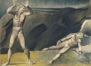
Could there ever be a criticism of Blake as an image-maker that set itself the same task as the critics of his verse – as Middleton Murry and Frye and Bloom and Erdman (or in a different register, Eliot and Leavis)? I don’t see why not, though the power of the poetry will always overshadow it. One possible starting point for such a criticism has always seemed to me a small watercolour belonging to Tate Britain, entitled – usually with a question mark – Los and Orc. Identities, even if here the two names from Blake’s mythology seem to apply, are difficult. Let us agree to call Los the figure of imaginative and political energy in human history as Blake conceived it, and Orc that same energy taking revolutionary form, often with blood on its hands. It is not clear what Blake thought about the blood at precisely the time he painted the watercolour, probably in the early 1790s, and even less clear what Los (here or in general) thinks. If the French Revolution was in question – and how could it not be? – then the year or month the painting was done would make a difference. Orc in the picture is manacled, somewhat weakly, four times to the earth (perhaps one of the manacles is hammered into a boulder). Orc may in Blake’s view be essentially Los’s doing, Los’s emanation, but Los may also in some sense – literal or mental – have forged the manacles. The bloody form of revolution may be a product of the imprisonment. The marvellous attentiveness and horror of Los’s body – it puts most other ‘neoclassical’ dumb shows utterly to shame, I think – tells the story. The yellow of the earth is Los’s openness and electricity, the black smudge on the hillside their repression. The yellow in particular – and its second appearance as a ghost on the hilltop next to the oily sea – is a stroke of genius. Los’s hands are a similar triumph. The way they catch the light and shade, and the way they touch the top edge of the paper, further electrifying the pictorial field – these reach back to Marcantonio’s engravings after Raphael and outdo them.
Blake scholars tend to be interested in the little painting because of its date. The evidence points to its having been done early in the 1790s, perhaps as early as 1791, which could suggest that Los and Orc emerged first as ideas for Blake in visual form, ahead of their elaboration in verse. (But who knows how many drafts of Europe and America have been lost?) Certainly the figures in Los and Orc recur (reversed by the printing process) as main actors in a scene at the start of America, published in 1793. There the shadowy daughter of Urthona – Beauty, Sexuality, Repression – joins Los in bewailing, which means also celebrating, red Orc’s ‘everywhere in chains’. Terror is close. It is not clear in the watercolour whether Los is recoiling guiltily from Orc’s agony or is afraid the manacles will tear from their sockets.
‘Compell the poor,’ says Urizen, reading from his book of brass, ‘to live upon a Crust of bread, by soft mild arts’:
Smile when they frown, frown when they smile, & when a man looks pale
With labour & abstinence say he looks healthy & happy;
And when his children sicken, let them die; there are enough
Born, even too many, & our Earth will be overrun
Without these arts.
Parson Malthus is on Blake’s mind. But stop. I believe my comparisons and quotes are apposite, yet I have nonetheless reproduced in the last paragraph what seems to me the problem with criticism of Blake as an artist. All critics of the poet’s visual imagery, wishing to understand what they are looking at and feeling the weight of Blake’s words close by, inevitably turn to them for guidance. The poetry begins to enfold the image; it frames and informs it; it claims the image as an extension or intensification of prophecy. But is this what matters in the watercolour? I think not. The image is great not by reason of what it may mean but by reason of its distinctness, its emptiness, the ferocious boundedness of its imagining of a (non-)meeting of bodies. And to say this, we know, is to follow Blake himself.
‘A Spirit and a Vision are not, as the modern philosophy supposes, a cloudy vapour, or a nothing: they are organised and minutely articulated beyond all that the mortal and perishing nature can produce’: this is Blake addressing his public in 1809. ‘He who does not imagine in stronger and better lineaments, and in stronger and better light than his perishing mortal eye can see, does not imagine at all.’ ‘Nature has no Outline, but Imagination has.’ ‘The more distinct, sharp, and wiry the bounding line, the more perfect the work of art … How do we distinguish one face or countenance from another, but by the bounding line and its infinite inflexions and movements? What is it that builds a house and plants a garden, but the definite and determinate … Leave out the line, and you leave out life itself.’
Again, there are dangers here. Blake’s theory of art is one thing, his practice another. The ‘bounding line’ in Los and Orc is a flexible, pragmatic invention, moving in and out of focus as the whole image dictates. The right edge of Los’s body has many possible positions in space: ‘movements’ overtake it. Orc’s torsion and compression come out of – are an expression of – the darkness pressing down on him. The darkness is as ‘indeterminate’ as watercolour can be.
But let us interpret the bounding line, and the ideals of distinctness and ‘minute articulation’ proposed in Blake’s writings, as broadly – as undogmatically – as Blake himself did, brush or burin in hand. Los and Orc is a prototype. Everything I have said of its treatment of edge, space and colour remains true of the best of Blake’s later achievements in painting: true to God Judging Adam and Hecate and The House of Death, or the intricate tonal mosaic of David Delivered out of Many Waters, or the delicate spacemaking colour of The Death of the Virgin, or the brutal symmetries of The Blasphemer. Nonetheless, it is still the case that between Blake as poet and Blake as maker of pictures there remains an enormous, discomfiting gap. For Blake is not a ‘visual’ poet. That is to say, his concreteness is not descriptive, not attached to the specifics of appearance. ‘If the doors of perception were cleansed, every thing would appear to man as it is, infinite./For man has closed himself up, till he sees all things thro’ narrow chinks of his cavern.’ The eye is one such chink. Blake’s poetry is out to ironise eyesight – in other words, boundedness and identity – in order to have the forms of infinity flash up before us as only language can have them flash. Blake’s poems are songs, dependent on the power of word or cadence to evoke, for a moment, the full particular that makes one state of the human present, before, inexorably, the line and argument move on; or improvised epics, likewise carried most powerfully by the timbre of the singer’s voice, always bewildering and repetitive, pushing impatiently forward, impelled by an unexpectedness (a peripeteia) to come. Neither lyric nor epic need, or want, to dwell on what the world exactly looks like. The rose is sick, not red, multifoliate, or blown at the edges (well, ‘crimson’ does get a brief nod); its predicate invites essentially the question why; and the next line of verse, without spelling out the connective, provides an answer.
Writing in Blake, then, races past us, conjuring possibilities, positing and liquidating identities. ‘I am like an atom/A Nothing left in darkness, yet I am an identity/I wish & feel & weep & groan.’ ‘He saw the indefinite space beneath & his soul shrunk with horror/His feet upon the verge of Non-Existence.’ ‘She rose up e’er the dawn of day/ … drawn thro unbounded space/Onto the margin of Non-Entity.’ The verge of Non-Existence is Blake’s territory.
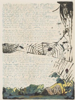
Pictures are different. But I make a distinction here, as I think Blake did, between pictures and ‘illuminations’. The Illustrations of the Book of Job affirm, at the end of Blake’s career, exactly this difference between ‘picture’, meaning framed and determinate scene, bodies within it all shimmering with substance and wonderfully ‘closed up’, and a contrary use of visual form, more open, random and decorative. This latter formal language, of which Blake was certainly also master, is writing’s visual accompaniment and extension. The great pages of Europe, displayed on one wall at the Ashmolean, are an example. In the best of them Blake’s visions live happily in the margin of the text, their various sinuous or reticulated identities – a vine, a worm, a spider’s web, a flyspeck, a snake, a flame – sucked into writing’s (non-) space and treading the air between sense and nonsense. I remember that when I taught Blake in the 1990s, back in the high times of deconstruction, it was above all the damage illumination of this kind often did to Blake’s ‘punctuation’ that the new critics seized on: a comma becoming a bird’s wing (or maybe not) and a swarm of insects swallowing a full stop and putting parts of speech in doubt. It seemed liberating, this constant insubordinate flicker at the edge of Scripture. But I think it only one side of the story. There is still in the Job illustrations, clearly, a main ‘scene’ on the page, marked off from the margins by a four-square frame, and within the scene itself there are Job’s frescoes inside their roundels. Image and Word are distinct. The margins in the series are all strong and subversive, twisting and fragmenting the words from the Bible (often much more so than in Plate 20); but the picture still stands apart from them, its solidity intact. Ideas of boundedness and high definition are essential.
These matters become less polarised, I think, if we try to escape from the notion that boundedness and determinacy in Blake have to do necessarily with line. Both my main examples so far – the Job series and Los and Orc – show that this is not true. ‘Outline’ in Blake is a word for distinctness and salience, however arrived at. Distinctness is above all a property of space. And, more particularly and technically, it seems to issue from Blake’s strange and elaborate printmaking process – his endless experiments with the matter of ‘relief’. Michael Phillips, the curator of the Ashmolean show, has spent years trying to fathom – even to reproduce – the deep mysteries of Blake’s procedure. The actual recession or shallowness of the etched parts of the plate; the nature of its inking; the pressure of his press; the elaborateness of Blake’s ‘retouching’ in ink or chalk or rough kinds of tempera – all these remain hard to be sure of. The central chapters of Phillips’s catalogue are admirably dogged in pursuit of the artist’s methods, but one hears the great Satan’s laughter in the background. ‘This I shall do by printing in the infernal method, by corrosives, which in Hell are salutary and medicinal, melting apparent surfaces away.’ The infernal method keeps its secrets.
Phillips, looking round for contemporary testimony, quotes from a reminiscence by Frederick Tatham, who saw Blake at work towards the end of his life. What he says aids understanding of prints made much earlier. The great ‘final state’ of the 1795 The House of Death, borrowed for the Oxford show from the Fitzwilliam, seems to open itself to Tatham’s description. (Millboard, which gets a mention in passing, is a thick paper of the kind often used to bind books: Blake used it sometimes instead of copper as his support.)
He painted roughly and quickly, so that no colour would have time to dry. He then took a print of that on paper, and this impression he coloured up in watercolours, repainting his outline on the millboard when he wanted to take another print. This plan he had recourse to, because he could vary slightly each impression; and each having a sort of accidental look, he could branch out so as to make each one different. The accidental look they had was very enticing.
Tatham makes clear in another letter that the ‘accident’ was not just a spur to variation from Blake’s point of view, but a quality in itself, which the artist for some reason wanted and then elaborated. ‘There was a look of accident about his mode which he afterwards availed of, and tinted so as to bring out and favour what was there rather blurred.’
The Ashmolean show has three versions of The House of Death hung in a row – it is tremendous to see them together. One of them, from the British Museum, is a little muted, possibly faded with time; but the other two, from Tate and the Fitzwilliam, are strong instances of the ‘each one different’ Tatham describes. My guess is that the Fitzwilliam print is the last of the three: I certainly think it is the best. That is to say – trying to put together Tatham’s insights and Blake’s own more relentless statements of intent – it is the one that strikes the most complex balance between a ‘look of accident’ and ‘stronger and better lineaments … stronger and better light’.
In The House of Death Blake is illustrating some grisly lines from Paradise Lost:
A lazar-house it seemed, wherein were laid
Numbers of all diseased, all maladies
Of ghastly spasm …
Dire was the tossing, deep the groans; Despair
Tended the sick, busiest from couch to couch;
And over them triumphant Death his dart
Shook, but delayed to strike, though oft invoked
With vows, as their chief good, and final hope.
So the traditional title of the print is euphemistic: this is more ‘The House of the Death that Refuses to Come’. Despair takes up position to the right of the scene, holding a knife but too stupefied to use it. In the Fitzwilliam print there is no sign of Milton’s darts (which appear in the Tate version as shards of ice) and Death’s instrument looks to be simply a scroll: it is written, says the scroll-bearer, when your agony will end. God-the-Father and Death are conflated. Once again, as in Los and Orc, a set of flexed fingers (those of the victim in spasm closest to us) pulls us into the pantomime. God-the-Father has his wrinkled eyes closed, but not, one senses, out of compassion.
I know that the word ‘relief’ in this context has an intolerable double meaning, but the triumph of the Fitzwilliam version is technical: it depends on the creation of a space fully appropriate to the appalling subject matter. There is much more colour in the Fitzwilliam print than in Tate’s or the British Museum’s – above all, an invading fiery red. It seems to be consuming a huddled sufferer in the right background. And there are more decisive deep darks, holding and floating Death on his cloud. Death’s hyper-patriarchal beard, whose locks in the Tate version seem individually combed and arranged as by a cosmic hairdresser, is now cut off abruptly by the cloud of fire. Colour and edge conspire finally to put God nowhere – in a dreadful non-proximity to the humans he won’t help. Spatially again – as with Los and Orc, but now on a grander scale, and deploying with utter certainty a baffling range of techniques – Blake thinks his subject through to the bitter end. The tension between sharp unforgiving salience and volatile, smouldering, blotted ‘atmosphere’ is stretched almost to breaking point. A pale halo insists on Despair’s idiocy. The sufferers catch reflections from Urizen’s fire. The bottom edge of Death’s beard is as sharp as an axe.
It seems to me tragic that art of this stature, which in English art is such a rarity, remains in practice a thing ‘off to one side’. In a sense, of course, that is where it belongs. Blake was a revolutionary (and counter-revolutionary) craftsman. He came out of the world of London sectaries. His trade was basic to his worldview. He is as separate from the main line of gentility as any English artist has ever been. Previous ages may often have been cloying in their worship of the master, but at least at their best they tried to respond to his challenge. Nowadays, standing in the ‘1915’ gallery at Tate Britain (the octagon next to the bookshop), it is hard to remember that here the walls were once packed tight with tier on tier of Blake’s paintings, with through the door Palmer and Fuseli and Flaxman as comparison. (The mosaic floor of the Blake Room, covered in aphorisms drawn from The Marriage of Heaven and Hell, is still underfoot as reminder. My guess is that the room’s early 20th-century designer had Job’s diorama specifically in mind.) In the new Tate, Blake is confined to an eyrie at the end of the Turner wing, up stairs most visitors miss. Perhaps in time he will come back to his non-place – central, minatory and inassimilable – in the story of British art.
Send Letters To:
The Editor
London Review of Books,
28 Little Russell Street
London, WC1A 2HN
letters@lrb.co.uk
Please include name, address, and a telephone number.


