Only about 120 of Barnett Newman’s sparse output of paintings survive, and nothing from before the mid-1940s, so the 109 items in the exhibition at Tate Modern until 5 January – which includes sculpture, and groups of prints and drawings as well as paintings – represent a remarkably large proportion of his work. He started late. Onement I, a modestly sized upright brown canvas divided by a vertical vermilion band, the picture he reckoned to be the first in which he found his distinctive voice, was painted in 1948, when he was well into his forties. He had his first one-man show in 1950.
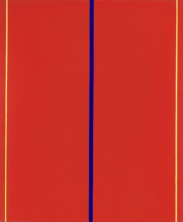
His pictures are easy to recognise and might be supposed to be repetitive: in most of them narrow stripes (what he came to call ‘zips’) run from the top to the bottom of a canvas painted all over in one colour or, more rarely, in vertical bands of two or three colours. In fact, the first thing which strikes you on seeing a lot of the pictures together is how varied they are, both in appearance and in feeling. They are usually rather large, something over human height; some are very large indeed: Who’s Afraid of Red, Yellow and Blue II (1967) is about ten feet by eight feet.
To find out how they affect you, you must look at them longer than their sparse content would suggest was necessary. It is best to follow Newman’s instructions and get close: a notice tacked to the entrance of his 1951 exhibition in the Betty Parsons Gallery in New York, read: ‘There is a tendency to look at large pictures from a distance. The large pictures in this exhibition are intended to be seen from a short distance.’
Then, with your visual field filled to overflowing, see what happens, attending in particular to the way what happens in front of one picture differs from what happens in front of another. For me, the moment when they work does not come predictably, nor can I be sure a canvas will have the same effect at different times. The black, grey and white images, some on bare canvas, are the ones which most often become significant – the ones I would say were beautiful if I didn’t feel the need for a word which takes more account of the energy they generate. Some of that energy comes from the placing and proportion of the zips, which set the beat, regular or syncopated, of the picture. Some comes from the brush marks, and in particular those found on the outer margin of an area cut by a masked line. To make his zips Newman stuck lengths of masking tape – a new invention, which allowed automobile paint-shops to do a neater two-tone spray job – on the canvas. Sometimes paint has bled under the tape – in particular when it was applied to an area of bare, unprimed canvas – and blurred the edge of the line. He makes you notice this kind of detail. Although the late pictures are more neatly made there is never any doubt that these are handcrafted objects.
You will know you have missed what Newman promises if, after a long look, you are left cold: if you don’t achieve the state of mild intoxication that is the currency in which these (like a lot of other pictures, not all of them abstract) pay their dividends. There are works of art which reward one in other coinage – the intellectual pleasure which goes with disentangling intricate patterns would be one instance. But Newman, who sometimes seems inappropriately grouped with the Abstract Expressionists, and in whose pictures the gestural violence of Pollock or de Kooning is reduced to flutter along the edge of a colour field, had, nonetheless, spiritual ambitions quite as exalted as theirs. A statement issued to visitors to his 1950 exhibition read:
These paintings are not ‘abstractions’, nor do they depict some ‘pure’ idea. They are specific and separate embodiments of feeling, to be experienced, each picture of itself. They contain no depictive illusions. Full of restrained passion, their poignancy is revealed in each concentrated image.
Such belief in the spiritual dimension, such confidence about how much feeling he can pack into a simple stripe, separates Newman (and the heroics of one phase of American Modernism) from some of what followed: for example, the dandified refusal to risk explanation which marks Minimalism and the ironic knowingness about commerce which marks Pop. But while his claims are hubristic and his titles (Death of Euclid, Dionysius, Vir Heroicus Sublimis) seem to have no clear relation to what you see (many were applied after the pictures were painted and from the beginning attracted derision – The Stations of the Cross even caused offence), his pictures do make you feel pleasantly serious. The experience Newman offers is intended to be elevating. That, I suppose, is what the titles announce. His writings clearly rule out the alternative: deadpan humour.
Take a couple of examples and see how they work. In the 14 Stations of the Cross, painted between 1958 and 1966, you get delicate strokes of black which contrast with the crisp margins of zips – some animated by bleeds at the edge. The first eight stations are about 10 to 20 per cent black, the rest is bare canvas. Nine to 11 are bare canvas with 5 to 10 per cent white. Twelve and 13 are about 80 per cent black. Fourteen is nearly all white. Hung in sequence, they read as a single modulated sentence the climax of which – two emphatic blacks followed by white – is easy to read as darkness followed by a final blaze of white light. The difficulty which arises when you say little that is precise and mean much that is vague is demonstrated by a 15th picture, Be II, a white canvas with a narrow strip of red down one side and black down the other. It was exhibited on its own in 1962 as Resurrection, a title given it by the gallery-owner but disavowed by Newman. Newman did some more work on it in 1964 and decided to use it to finish the sequence. The red is too easily thought of as blood. Tacking the picture on at the end was a misjudgment.
Covenant from 1949 – a dark maroon ground divided into three vertical compartments by a red and a cream stripe – hits the retina hard. Move the eye to the left of the canvas after focusing on the stripes and after-images appear. Where Rothko’s soft-edged shapes absorb you, Newman’s harder ones hold you off. The picture is in one sense like an empty stage on which, as you watch – despite the fact that no actors appear – something important seems to be happening.
Language, in the absence of subject matter to hang adjectives on, is not well suited to analysing this sense of imminence. You are reduced to giving a solipsistic account of what you notice yourself thinking and feeling.
But there are still things worth saying. For one thing, at a distance of more than five decades, the historical situation in which New York painting was formed needs, for most of us, to be reconstructed rather than remembered. The catalogue finds a good way into that with Ann Temkin’s essay on Newman’s exhibition history.* The illustrations show these pictures in the places they were first hung in public: Betty Parsons’s small gallery (the biggest pictures need a whole wall), the brown velvet walls at Knoedler’s, where the pictures had to be raised above a wooden wainscot, the beamed carriage barn at Bennington College. This makes them seem stranger than in the large white gallery spaces they now demand. It was the context in which many early critics said, loudly, that these were paintings of nothing, empty and arrogant.
If we find them easy now, it is partly because we have learned not to care about content, and to seek out purely aesthetic pleasures in a long look. If these pictures are tragic or profound – in the way both Rothko and Newman believed pictures could be – it is in the rather vague way music is sometimes said to be. The feelings they rouse may seem too deep for words. I cannot get rid of the feeling that they could easily be too shallow.
Send Letters To:
The Editor
London Review of Books,
28 Little Russell Street
London, WC1A 2HN
letters@lrb.co.uk
Please include name, address, and a telephone number.


